New York did it. So did Amsterdam. And Northern Ireland, South Tyrol and Thuringia can also hold their own now. What’s it all about? City branding. What advantages does it bring? Ideally visibility in a booming industry, which already virtually offers everything imaginable – we are talking about tourism. But what does making a brand out of a city or a region mean?
A heart and three letters – that is all that was needed. After the New York State Department of Commerce commissioned the advertising agency Wells Rich Greene to develop a marketing strategy for the city of New York in 1977, the graphic designer, Milton Glaser, literally delivered the heart of the campaign: “I heart NY” – the heart as a symbol of course – is the probably most wellknown and most successful city brand to this very day. Glaser came up with the idea for the logo that is reduced down to the absolute minimum and thus reminds one of a mathematical formula and which is both easy to understand and totally positive regarding its statement during a taxi journey through Manhattan. At the time New York was in sore need of positive vibes: The criminality in the Big Apple had reached an historical level, whole districts were falling apart, the city’s bank accounts were empty. The fact that tourists from all over the globe see the metropolis totally differently today is not least thanks to the hearty campaign, which also generated bombastic turnovers – the official merchandising items bearing Glaser’s design earn more than 30 million US dollars a year. The creator never saw a cent of it himself – he completed his work as a pro bono job, out of his love for the city. However, his idea has been copied countless times – the state of New York has filed lawsuits against copyists around 3,000 times to-date.
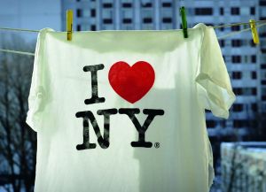
A heart and three letters: Launched in 1977, “I heart NY” is the probably most well-known and most successful city brand to this very day.
Ultimately, this set a precedent for city branding – over the following decades cities all over the world strived to establish themselves as a brand. Hereby many tourist metropolises succeeded in creating strong, successful or at least unmistakable identities – London, Paris or Rome automatically spring to mind, or “Be Berlin”, “Only Lyon” or “What happens in Vegas, stays in Vegas”. Other cities were less successful: What makes a “Flower City” (Brampton) or “O! Omaha” attractive? What are slogans like “The future lives here” (Surrey), “See it. Do it.” (Sunderland) or “It’s Daejeon” actually trying to say? In China there even is a programme for “speciality cities”: Thanks to funding provided by the government there is now a “Sex Toy City”, a “Shiitake City”, a “Leather Clothes City” and around 400 other special destinations. By 2020, the number is expected to rise to 1,000 including new districts, museums or industrial centres. The aim behind such prestige projects is not only questionable from a touristic point of view.
“Authenticity is decisive for travel destinations,” according to Verena Feyock, Managing Partner and expert for destinations at Saint Elmo’s tourist marketing department. “In today’s digital era, only places with real content are able to stand out from the masses. After all, the social media channels enable the visitors to share their own photos, impressions and assessments with millions of people, so the self-portrayal can’t completely deviate from the reality. To this end, one should clearly position oneself and know what one stands for and present one’s product in a credible way – under the umbrella of a brand.” The umbrella brand I amsterdam that was introduced in the Dutch capital in 2004 is a successful example here. The slogan brought a fresh breeze into the hitherto poorly maintained image of Amsterdam, the red and white lettering on the Museumsplein became one of the most popular photo motifs of the city – so popular that the city government had the letters dismantled in December 2018 and brought to a less exposed place in the city because the small square was already totally overcrowded. Cities have the advantage that they are geographically limited and that their inhabitants share a strong identity. Tourist marketing for regions is more difficult – especially when these are characterised by strong cultural diversity, which initially makes it hard to find an overreaching image, or if the region has not attracted many tourists so far.
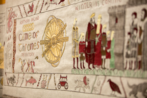
“Tourism is definitely a growth market: Destinations are rallying for visitors, tourism organisations strive to generate awareness and souvenirs and merchandising are appealing sources of turnover,” stated Emma Reynolds, Sales Manager at the London-based merchandise distributor, Outstanding Branding, whose clients in the tourism field include among others players such as Tourism New Zealand, Lonely Planet and Edinburgh City Tours. “Brand awareness can only be efficiently aroused if the brand has previously been clearly defined. That is why one of the important questions we ask our customers is: ‘Where are you based and what do you as company stand for?’” In the Ulster Museum in Belfast one can experience how a region that wasn’t among the top travel destinations so far, is literally weaving its brand story – to be precise on a 77 m long tapestry. The latter shows epic battles and huge dragons, murder and intrigues the and Battle for the Iron Throne. It recounts the story of the TV show Game of Thrones sequence by sequence and attracted over 130,000 visitors to the Ulster Museum within one year. The hand-woven wall ornament wasn’t thought up by the makers of the American series, but instead by Tourism Northern Ireland. “Linen has been produced in Northern Ireland for hundreds of years, one of the most famous pieces of art made of linen is the Bayeaux Tapestry, which portrays acts of war – a good connection to Game of Thrones, which is about the battle to rule over the fictitious kingdom, Westeros. So, using a traditional handicraft we created an impressive tapestry and an experience for the visitors, which has the potential of becoming a permanent attraction,” explained Brian Twomey, Marketing Director at Tourism Ireland, the partner organisation of Tourism Northern Ireland. But what has the green island got to do with the HBO series and why should a Game of Thrones attraction seduce visitors to Belfast?
In fact, Northern Ireland was one of the main film locations of the successful fantasy series from the very beginning: Since 2010 scenes such as Winterfell, the Kingsroad or the Iron Islands have been filmed in the counties Antrim and Down. The rugged beauty of the landscapes – majestic mountains, steep coastlines and ancient trees – significantly contributed towards the look of the series. Ultimately, the London-based agency, Publicis, made reference to the high recognition value of the film locations and thus the related storytelling potential. “Together we wanted to address the fan community directly – with Game of Thrones style content, which was to contain subtle references to Northern Ireland as a holiday destination,” summed up Twomey. The tourism association enquired by HBO and ultimately received the go-ahead for using the typical design free of charge. “Hence Northern Ireland became ‘Game of Thrones Territory’ and we achieved the necessary authenticity to create relevant contents for fans – we don’t have a touristy approach, we communicate in the language of the show,” Twomey reported proudly.

Bridge building for branding
But how is it possible to create an authentic universal communication for a region like South Tyrol, which accommodates three cultures, where German, Italian and Ladin are spoken, where craggy mountains meet soft, Mediterranean valleys? “Such heterogeneous factors don’t prevail in such a confined space anywhere else in Europe other than here in South Tyrol,” emphasised Martin Bertagnolli, who is responsible for market and brand management at IDM Südtyrol (Innovation, Development and Marketing). The organisation that is responsible for marketing the popular holiday destination and the agricultural produce initiated and promoted the development of the destination into an umbrella brand. For this aim what attracts visitors to the province was analysed – is it the mountains or is it the wine? The luxurious accommodation options or the friendly inhabitants? Hiking or cycling tours or the extensive offer of winter sports? “Our guest surveys regularly reveal that visitors especially appreciate the people, the products and landscapes of South Tyrol. However, there are beautiful towns and good products in other places and one can find nice people everywhere. It is thus decisive for us to highlight the features that the holiday-makers can only experience here. What’s more, the brand also has to work within the given area – the people here should be able to recognise themselves immediately.”
To this end, the regional marketers approached the Berlin-based agency, Metadesign. Together they drafted an image that integrated the different aspects of the region and represented them appropriately. The result was the official positioning that has served ever since as the orientation for the communication and product development: South Tyrol is the high-contrast symbiosis between alpine and Mediterranean, spontaneity and reliability, culture and nature. “The attributes that turn our state into more than just a spot on the map are incorporated into our slogan – they stand for the unique lifestyle. When you sprinkle Italian Parmesan onto spinach dumplings and season it with olive oil, you will notice that even ingredients that at the first glance have nothing in common, can harmonise together excellently,” summed up Bertagnolli. In line with the set course, the look for a uniform corporate design was created. Here, the agency developed a characteristic script for the icon brand in coordination with the tourism professionals, which depicting a stylised alpine panorama makes up the destination’s logo. The logo colours – shades of green and red, lightblue, yellow and orange – represent nature, the seasons for the travel destination that is popular all-year-round as well as reflecting typical regional products like wine, milk and apples. This creates a visual bracket, which unites the different touristic, agricultural and gastronomic attractions of the province that lies at the most northest tip of the country.
Fine dining

Anyone, who always wanted to know how glass, ceramic or porcelain are processed, can look over the shoulders of the masters in the Thuringian manufacturing companies. One of the stylish results is at the same time the first merchandising item of Thuringian Fine Dining – the “Tavolina in Aqua” by Eschenbach Porzellan.
Maria Mönning from the Thuringian tourism association Jena-Saale-Holzland also knows how important a connecting element is for regional marketing. The “Thüringer Tischkultur“ (Thuringian Fine Dining) initiative unites the dishes, handicraft tradition and hospitality under one brand and one logo – a green-based serving cloche. “During a working committee for the production of traditional glass, ceramic and porcelain items, the idea arose in 2015, to combine local produce and specialities with typical handicraft products – Thuringian Fine Dining was born. With the aid of the tourism budget granted by the Thuringian Ministry for Economic Affairs, Science and the Digital Society, we contribute towards promoting the regional identity,” explained Mönning. In the meantime, the network encompasses 46 partners, including agricultural direct marketers, gastronomy and artisan businesses as well as hotels, who co-shape the culinary voyage of discovery. Quaint country markets and farm shops, small breweries, cafés and roasting companies entice the guests. Museums dedicated to the theme are also part and parcel of the initiative. The brand stands for the high quality of the wide-ranging offer and emphasises the USP of the region. “The certified partners, who are gathered under the serving cloche, have to fulfil clear quality criteria such as the guaranteed sale of regional and seasonal products, providing a special degree of hospitality and classic handicraft tradition in order to be able to use the concept as a means of advertising,” confirmed Mönning. The campaign includes among other things an own website and presence in social media. “Furthermore, we are also present at large public fairs and have noticed that we are totally on trend with this approach. More and more people are opting for sustainable travel and want to rediscover traditions.”
Make tourism tangible
Promotional products are an elementary part of the communication also for tourism marketing, whether at shows or on-site, whether as a giveaway or merchandising item. “One of the most important tasks of the players in the tourism marketing sector is planning the experience of the guests. Merchandising and souvenirs are a classic instrument here, which shouldn’t be neglected,” noted Feyock. The identity of the region plays a decisive role in the product development, as Reynolds explained: “On the theme of London for instance, we realised products in the shape of buses or including British tea, for Edinburgh Scottish shortbread in branded tins and in New Zealand, branded rugby balls – because it is their national sport, so it is popular there. Hence, the balls fit in perfectly to the slogan ‘100% Pure New Zealand’.” Original products were also created in Thuringia, as Mönning reported: “Thuringian Dining Cult” is a place setting comprising of a handmade wooden board with embedded small porcelain bowls, on which restaurants can serve a small surprise menu comprising of their specialities. The hosts mutually recommend each other and make reference to local establishments that also offer dining culture and thus serve as a source of inspiration for our connoisseur travellers.” The “Tavolina in Aqua” on the other hand, a hand-made bottle comprising of hard porcelain produced by the traditional manufacturing company, Eschenbach Porzellan, makes an ideal aesthetic and sustainable drinking solution on hikes through the state of Thuringia. Just like the Dining Cult, it accompanies the culinary journey and creates a tangible connection between the region and visitors. To this end, the bottle is offered for sale in the tourist centres of several cities. Furthermore, partner companies can implement the bottle as a gift and have it co-branded with their logo on the body of the bottle and cap or in the form of a laser engraving.
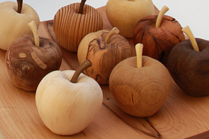
A successful interplay between simple aesthetics, appealing haptics and sustainable production are also called for in South Tyrol. “We want to make the region tangible to our guests – but only with items that satisfy our quality demands,” commented Bertagnolli. These include regional, sustainable materials as well as their production in the province. And of course the colours of the umbrella brand are implemented. “Plastic products from the Far East don’t suit us or our target group, for whom nature, activity, sustainability and originality are what counts.” The products that reflect these contents the best include table sets made of felt from South Tyrol or a hand-turned wooden plate made from different domestic tree species, filled with wooden apples, which at the same time stand for one of the most important export products. The high quality items are designed autonomously by IDM Südtyrol, produced by partner companies and make ideal gifts for instance for business partners and journalists. At sport events and the likes, classic give-aways such as key pendants, pencils and caps are implemented. In addition, the regional marketers award licenses to companies that want to produce merchandising items under the umbrella brand. This is how among others cycling jerseys, hiking trousers or woollen hats bearing the famous logo and mountain panorama have arisen.
Stories and gum shoes
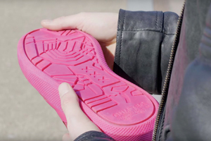
For the “Gum Shoe”, chewing gum was removed from the streets of Amsterdam and turned into soles of stylish sneakers.
In turn, Amsterdam offers a wide variety of original items that reflect the identity of the city – indeed far beyond the mixture between tulips, clogs and hemp leaves, that are offered in the respective souvenir shops: In the official I Amsterdam store lots of products created by domestic designers and start-ups can be found. The project “180 Amsterdammers” focuses on the huge cultural diversity of the canal metropolis in the book of the same name that was published in 2017: On 512 pages, 180 citizens of the city from just as many different countries describe their very personal perspective of Amsterdam. Ultimately, I Amsterdam implemented the “Gum Shoe” to draw attention to the 1.5 tons of chewing gum that is spat out on the streets of the city, the disposal of which costs several millions of Euros annually. Chewing gum was removed from the streets of Amsterdam in cooperation with the agency Publicis One and the company Gumdrop; the streetware label Explicit Amsterdam designed a shoe, the sole of which was made out of part of the collected chewing gum that was recycled for the purpose. Around 20% of the soles of the sneakers comprise of old chewing gum, 250 g were processed per pair. The shoe itself is made out of high-quality leather; the sole is decorated with a map of Amsterdam. “With these shoes, we take a step closer towards gum-free streets and, at the same time, create awareness among gum users without being preachy,” said Mustafa Tanriverdi, Head of Marketing and Investments for the Amsterdam Metropolitan Area. And visitors to Amsterdam can also take a part of the city home with them since June 2018, figuratively speaking and literally.
The throne is an eternal attraction
When it comes down to impressing Game of Thrones fans, marketing measures that make the series tangible are called for. The “superfans” that were affectionately referred to as “set-jetters” by Brian Twomey – they drive to the sets of their favourite show and want to immerse themselves in this parallel world – particularly let themselves be attracted by things that have rarity or collector’s value. For example, a stamp series depicting motifs from the show that the British Post Office released and which were issued free of charge in tourist centres. The Spanish division of Tourism Ireland tied up a package for influencers with large follower communities: Boxes containing original merchandising, paired with branded content aimed to persuade the recipients to share the photos of Northern Ireland that were sent with the packages on USB sticks on the respective websites, blogs and social media channels. However, it took a while before the haptic dimension was integrated into the marketing in the case of Northern Ireland. “As the overriding tourism authority we initially saw it as our task to attract people to the country – shaping the experiences on-site was to fall under the responsibility of the respective players. The fact that we ourselves have in the meantime created major attractions and are communicating on a product level is among others thanks to the complicated agreement process with HBO, which requires top level project management,” confirmed Twomey.
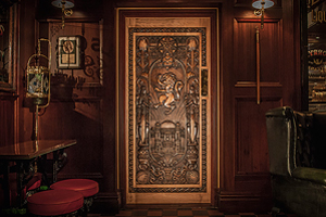
But also a blessing in disguise played a role in the process, when at the beginning of 2016 a storm wrecked one of the locations – the old beech lane, Dark Hedges, which was used as the setting for the Kingsroad in the series. Without further ado, the battered, ancient trees were turned into a new attraction: ten individual doors that were installed in popular restaurants and pubs at the respective film locations and which could be viewed on a guided tour as the “Doors of Thrones”. Each of the unique, detailed designs picks up on a storyline of the at the time pending sixth season. HBO provided the necessary information in advance so that the elaborately carved motifs of the doors could be revealed after the official broadcasting of the respective episode. “This meant we were totally topical and positioned real products in experiencable places – a live experience, that will outlive the series in the form of an attraction,” Twomey is certain. “The creation of physical anchors is decisive in destination marketing especially for film tourism, the marketing of the Lord of the Rings Trilogy in New Zealand set benchmarks here.” Furthermore, people, who visit the Doors of Thrones, receive a stamp for each door in an ID card produced especially for the purpose – an article that as a further collector’s item is considered to be of high value among the set-jetters. The figures demonstrate how valuable the re-branding is for Northern Ireland. According to statistics collected by Tourism Ireland, 120,000 travellers were motivated to visit the country by the brand presence in the year 2016 alone – that corresponds to an increase of 35 mil. Euros in turnover, the earned media for 2017 is estimated to be approx. 21 mil. Euros. The eighth and last season of Game of Thrones is going to be broadcast in 2019. With each individual episode the tapestry is nearing its completion more and more. What the creative heads from Northern Ireland then have in mind, has (not yet) been revealed.
// Claudia Pfeifer, Till Barth
photos: IDM Südtirol (2); shutterstock.com (1); Thüringer Tischkultur/Peter Eichler (1); Tourism Ireland/Publicis (2); YouTube/Publicis One Nederland (1)


